Quantcast
Channel: The Crib Sheet
Viewing all 326 articles
Browse latest View live

Héctor Germán Oesterheld's Swipe FIle - Part 2

$
0
0
I continue to notice how John Ford's films influenced Héctor Germán Oesterheld's scripts for some of "Sgt. Kirk"'s sequences. A rhetorical question comes to my mind, though: was it possible, in 1953, to avoid John Ford's influence when depicting Indians attacking a stagecoach? It was, at least if we are talking about different media like film and comics. In this post I will compare Hugo Pratt's panels with frames from Stagecoach, but, first, let's compare Pratt with Pratt:


Héctor Germán Oesterheld (w) and Hugo Pratt (a), "Rastros de fuego" [fire tracks],Misterix# 238, April 10, 1953 (page 72 of the series).


Héctor Germán Oesterheld (w) and Hugo Pratt (a): the same panel as published in the Portuguese version of the Mondadori album (Originally published inSgt. Kirk# 5, November, 1967).

As you can see the 1967 version is a lot more cramped than the 1953 one (somehow the stagecoach travels faster in the first example: the rocks and the panel border on the left squeeze it in the second version). The tree on the right side of the panel helps to underline what Oesterheld wrote on the caption (once again, said caption was completely destroyed by Pratt in his Sgt. Kirk version): 
As a matter of fact, appearing as if from inside a surprise box...
On the other hand in John Ford's sequence the entrance of the Apaches isn't half as spectacular (see below):


John Ford (d), Bert Glennon (p), Stagecoach, Walter Wanger, 1939.

During the attack John Ford (d), Otto Lovering (e), Dorothy Spencer (e), Walter Reynolds (e), do cross-cuttings between the interior and the exterior of the stagecoach. Oesterheld and Pratt do cross-cuttings between the attack (we never see the stagecoach's interior) and Maha, Kirk, and five more Tchatogas, who are watching from a distance (they participate in the action at the end, when the stagecoach reaches them). 

Hugo Pratt drew a couple more spectacular images of the chase (see below):


Héctor Germán Oesterheld (w) and Hugo Pratt (a), "Rastros de fuego" [fire tracks], Misterix # 238, April 10, 1953 (page 74 of the series).


John Ford (d), Bert Glennon (p), Stagecoach, Walter Wanger, 1939.

As we can see in the film frame above, the image loses readability because of the dust. John Ford chose a flat, but dusty land to film. Not being (much, anyway) constrained by the laws of physics, Pratt didn't eliminate dust, but he controlled it as he pleased...
To avoid the dust John Ford also filmed with the camera shooting ahead of the stagecoach:


                          John Ford (d), Bert Glennon (p), Stagecoach, Walter Wanger, 1939.


In both the film and the comic, Indians fall:


Héctor Germán Oesterheld (w) and Hugo Pratt (a), "El brujo blanco" [the white wizard], Misterix # 239, April 17, 1953 (page 77 of the series).


 John Ford (d), Bert Glennon (p), Stagecoach, Walter Wanger, 1939.

In the two examples above there's a subtle difference though: the profile shot is neutral (even if we know that the plot is on the deffenders' side); the front shot below puts the viewers on the stagecoach travellers' place (the Apaches are unequivocally, "the other threatening us").

Maybe the most famous shot in this Stagecoach sequence is the extreme low angle in which the camera was put in a hole (see below):


 John Ford (d), Bert Glennon (p), Stagecoach, Walter Wanger, 1939.

Someone should explain this to me though: the Indians don't shoot one of the horses pulling the stagecoach why exactly? It would effectively and easily stop it in a complete disaster. I don't know who said that in a bad story everybody is stupid (Peter David?). 


Stagecoach: a Quick Note

$
0
0

The least that we can say is that John Ford was faithful to his movie sites. Monument Valley comes immediately to mind, of course, but what about Beale's Cut?


John Ford (d), Bert Glennon (p), Stagecoach, Walter Wanger, 1939.


John Ford (d), George Scott (p), Straight Shooting, Universal, 1917.


John Ford (d), George Schneiderman (p), The Iron Horse, Fox, 1924. Beale's Cut is "playing" Brandon's Pass.

Here's an interesting site about the Cut as a filming location.

On Stagecoaches and Indian Attacks, Again! Can the Indians Attack a Stagecoach Successfully In a Sea of Eurocentric Mass Media Formulaic Products?...

$
0
0
...They can, at the hands of a truly great writer like James Edgar. If the result of the attack was drawn by a truly great artist like Tony Weare, it's the icing on top of the cake!


James Edgar (w), Tony Weare (a), "Shannon Gunfighter," published in the [London] Evening News on October 19,1961 (Photo by 
Jorge Machado-Dias).


A repro made in Italy (why did they change the caption place, though?...), Matt Marriott di Tony Weare [no need for the scriptwriter's name to appear, of course! Sigh!...], Edizioni Camillo Conti, November 1978.

Héctor Germán Oesterheld: A Desinformação Continua, Também Em Portugal

$
0
0
Na barbárie em que irremediavelmente megulhámos no século XXI a banda desenhada só é falada nos meios de comunicação de massas pelas piores razões. A regra é simples: só se fala do que vende... e a banda desenhada pura e simplesmente não vende. A não ser que esteja ligada ao cinema (e se for ao cinema comercial, tanto melhor...).

É por isso que o mais do que medíocre Sin City da mais do que medíocre dupla Rodriguez / Miller faz hoje capa da revista "Actual" do jornal Expresso. (Excurso retrospectivo: Sábado, 1 de Dezembro de 1990, "Expresso, a Revista", pp. 103-R a 106-R: "João Bénard da Costa: Dos Filmes e da Vida" - quando neste semanário ainda se falava de cinema a sério; há muito tempo, portanto...)

Mas não é para falar disto, que só merece o meu desprezo e o meu silêncio, que escrevo estas linhas. É que quem de direito lembrou-se de que, afinal, Sin City começou por ser uma série de banda desenhada (na revista Dark Horse Presents da editora Dark Horse, já agora...) e resolveu activar o seu há muito desactivado crítico de banda desenhada de serviço (ou deveria escrever: "crítico de BD"?), João Paiva Boléo. O texto deste é reverente quanto baste para com os patrões, mas não deixa, felizmente, de mencionar o voyeurismo e a violência que não têm nada de gratuito, antes indicam uma ideologia machista e de extrema direita.

Mas, passons, como disse e repito Sin City só merece o meu desprezo e o meu silêncio. Onde João Paiva Boléo borra a pintura é na última frase onde cita "Alack Sinner" (Muñoz e Sampayo), "Corto Maltese" (H. Pratt) e "Mort Cinder" (A. Breccia). A. Breccia? A sério? E porque carga de água é que "Alack Sinner"é, e bem, de Muñoz e Sampayo enquanto "Mort Cinder"é de A. Breccia? E Oesterheld, onde está? Os críticos de banda desenhada europeus teimam não só em não reconhecer o maior argumentista da história da banda desenhada (campo restrito) como tal, mas, pior: por uma estranha razão (a que Ugo Pratt está longe de ser alheio) tendem a obliterá-lo completamente e a despossuí-lo daquilo que genial e genuinamente criou.


Héctor Germán Oesterheld (e), Alberto Breccia (d), Misterix# 719, 24 de Agosto de 1962.

A Quick Note From Seth

$
0
0
In a private correspondence with Seth he pointed out that the stairs I mention below are two different sets of stairs because those are two different houses. I stand duly corrected.

Death As a Character

$
0
0
March 5, 1975, somewhere in Argentina: Carlos Trillo and Guillermo Saccomanno interviewed Héctor Germán Oesterheld (Oesterheld was living underground already for political reasons; the interviewer, Saccomanno, means the characters): 
"Why do you always kill them all?
Because of that character no one really takes advantage of, which is death." 
This Blog is dangerously becoming monographic, but a Blog is a log, after all, and I write about what interests me at any particular moment. The day my focus turns elsewhere my posts will change accordingly, of course... That said I feel more and more that, maybe, I should be writing in Spanish because Oesterheld's work will never be published in any English speaking country. I don't do it in the hope that many (yeah, right!) readers talking many languages (Spanish included) understand our modern (and post-modern) Latin.

The fact that no English speaking country will ever publish Oesterheld's work is yet another symptom that comics are not an art form like all the others. Even in today's Barbarian times it's a bit unthinkable (but is it, really?) that an English speaking country wouldn't publish Kafka or Proust. Worst than that though: excluding El Eternauta [the Eternaut], for political, more that artistic or literary reasons, Oesterheld's work isn't even published (reprinted) in Argentina (Where's Randall, where's Sgt. Kirk, where's Bull Rockett, where's the complete Ernie Pike, Amapola Negra, Ticonderoga, Mort Cinder, 'Loco' Sexton in a restored fac-simile edition with good production values?)

Anyway... I started this post quoting Oesterheld himself talking about the death of his secondary characters and the death of his protagonists even (like Randall in the series "Randall, 'the Killer'"). In highly formulaic action stories the bad guys are always awful shooters while the hero kills twenty with a slug. Oesterheld couldn't go against that completely, of course, because he worked, after all, in a commercial context, but he could (and did) minimize the unconvincing parts of the formula. He used a few strategies to do that: the most important, because it has ethical consequences, was to avoid (again, not completely) Manicheism; another one explained his protagonist's victory with said protagonist's intelligence, rather than violent inclinations; the death of the good guys was another one (in a war no one is safe). His masterpiece, according to strategies one and three (it's not even a pop story, in my humble opinion) is "Amapola Negra - 'Black Poppy'." But "Amapola Negra" and "Ernie Pike" were published in Oesterheld's own Editorial Frontera (and so was "Randall"), which meant that he had more freedom to do whatever he pleased...

I'm not talking about Editorial Frontera here, though. The examples that I show below (besides the great death of Randall) are part of Oesterheld's career outside of his publishing house: in Abril and Columba (early to mid 1950s and early to mid 1970s).

  
Héctor Germán Oesterheld (w), Hugo Pratt (a), Stefan Strocen (c), "El Sargento Kirk: El pais de los Mungos" [Mungo Country], Editorial Abril, Misterix # 353, July 7, 1955. "El pais de los Mungos" found the trio in a creative state of grace. It was in 1955 that Hugo Pratt found his later style and Stefan Strocen reached a peak in his work for Misterix.

I'm not completely sure, but I think that Dinard's death above may very well be the first disappearance of a main character in Oesterheld's oeuvre. It's interesting how Corto (yes, exactly like in Corto Maltese) deflates the drama. A fight was going on and they didn't have the time to stop and mourn. Here's what Corto said after Maha gave him the news of Dinard's death: "Good for him. What can a man want more than to die as he lived?"


Héctor Germán Oesterheld (w), José Luis Garcia López (a), I don't know who the colorist was, "Roland el Corsario: Algo más que un reino" [something more than a kingdom], Columba, Fantasía # 236, January 1974.

Columba was a traditional highly commercial publishing house. Oesterheld ended up working there because he needed to put bread on the table. However, he was such a towering figure (the writer of El Eternauta, no less) that his editors and publishers gave him some creative autonomy. That's why he could kill off some of the characters, as seen above. 

Below, the poetic death of Randall...


Héctor Germán Oesterheld (w), Arturo del Castillo (a), I don't know who the letterer was, "Randall, 'the Killer': Jinetes vengadortes" [vengeful riders], Editorial Frontera, Hora Cero Suplemento Semanal # 28, December 3, 1958. Here's what's in the captions in the three last panels: "It was then that the vital spring that tied him to life yielded. / Because of his efforts blood spurted from his reopened wound. The red lymph mixed with the recently stirred dirt... / ...and continued to run down, as if seeking to warm up the already freezing bosom of Martine."


Milton Caniff, "Terry and the Pirates", News Syndicate, the death and burial of Raven Sherman in three consecutive daily strips: October 15 - 17, 1941.

Readers reacted strongly against the death of both Randall and Raven Sherman. So much so that Oesterheld had to resurrect his character and MIlton Caniff never repeated such a stunt again. "Terry and the Pirates" was a mediocre juvenile adventure strip during the 1930s. It improved a bit during WWII, but, besides some good qualities (Caniff's female characters, Burma and Hu Shee especially, and some interesting story arcs - the excellence of the art and the colorful language aren't even worth mentioning) it never surpassed, if I remember correctly, stereotyping (Connie is overtly racist) and Manichean formulas. He explained very well why he killed Raven though (it's reason number 3):  
"Ever after that if somebody in the strip became ill or hurt or hit by a car or thrown off the back of a truck, the reader knew - well, Jesus, he killed off Raven Sherman, and now he's going to kill off this character. That's the real reason for doing it, to put credibility in there, instead of - oh, well, he'll get out of it somehow or come back to life or something. Soap opera stuff."


Death As a Character - Coda # 1

$
0
0

Héctor Germán Oesterheld (w), Hugo Pratt (a), Stefan Stocen (c), "Tierra enemiga," Misterix # 345, May 6, 1955.

Readers of Misterix just needed to look at Hugo Pratt's art and Stefan Strocen's colors (with his somewhat reduced warm palette - it's a shame that only 22 out of 120 pages are in color in "El pais de los mungos") to see that something changed for the better in the Sgt. Kirk series at the end of "Tierra Enemiga" [enemy land] (page 104 - 608 of the series above), but especially during most of "El pais de los mungos"' [Mungo country's] run (from issue # 348, May 27, 1955, until issue # 377, December 23, 1955). After that Hugo Pratt's art went in a downfall until his Frontera years (maybe he lost interest in Sgt. Kirk - to the point that, in an interview with Dominique Petitfaux, 1528 pages seemed like 5000 to him). I don't know what happened exactly in Hugo Pratt 's private life during his Abril (and "El Sargento Kirk") years, but he's not known for being a workaholic exactly. Maybe he decided to, at least, moderate his nocturnal adventures in 1955 because this work stands out as some of the best that he ever created. I particularly like how it's Autumn at the end of "Tierra enemiga", with leaves falling from the trees, and the series continues through Winter in "El pais de los mungos", with snow falling and snow covered landscapes (see below).  


Héctor Germán Oesterheld (w), Hugo Pratt (a), Stefan Strocen (c),"Tierra enemiga," Misterix # 345, May 6, 1955: Autumn.


Héctor Germán Oesterheld (w), Hugo Pratt (a), "El pais de los mungos," Misterix # 359, August 12, 1955: Winter.

What about Oesterheld though? It's not that easy to realize at first sight that a story is greater than the one preceding it. Well, Oesterheld's narrator (see below) charged himself with the task of explaining to us that, after Dinard and General Harper died, this was not "an adventure like the previous ones..." 


Héctor Germán Oesterheld (w), Hugo Pratt (a), Stefan Stocen (c), "El pais de los mungos," Misterix # 356, July 22, 1955.


Death As a Character - Coda # 2

$
0
0
Yesterday I said that, after the story arc "El pais de los mungos," Hugo Pratt's art declined. I didn't change my opinion since then, but there are some cinemascopic panels on the covers of the next long story arc, "Ruta de sangre" [blood route] (119 pages) that seem to disprove me. What happened is that Hugo Pratt realized at some point that, since Misterix had a landscape format (with three tiers) the best that he could do was to adapt drawing wide panels (that's, by the way, why his adaptation of the series to the portrait format in Ivaldi's Sgt Kirk magazine is so "unnatural" - I gave you an example of what I'm saying below already). These are some sparks in a rather gray panorama, though. The brilliance of "El pais de los Mongos" was far behind...

It's not the first cinemascopic panel in the series by any means, but here's a good example before "Ruta de sangre":


Héctor Germán Oesterheld (w), Hugo Pratt (a),"El Sargento Kirk: Blanca Sombra" [White Shadow], Editorial Abril, Misterix # 403, June 22, 1956.

Without further comments here are three examples of what I'm talking about above (the height of these panels is bigger than the height of the black and white panel because the cover had two tiers instead of three):


Héctor Germán Oesterheld (w), Hugo Pratt (a), Stefan Strocen (c), "[El] Sargento Kirk: Ruta de sangre," Editorial Abril,Misterix# 422, November 2, 1956.


Héctor Germán Oesterheld (w), Hugo Pratt (a), Stefan Strocen (c), "[El Sargento Kirk]: Ruta de sangre," Editorial Abril, Misterix # 426, January 2, 1957.


Héctor Germán Oesterheld (w), Hugo Pratt (a), Stefan Strocen (c), "[El] Sargento Kirk: Ruta de sangre," Editorial Abril, Misterix # 430, February 8, 1957.


...Oh, and, by issue # 387 of Misterix it was Summer already:


Héctor Germán Oesterheld (w), Hugo Pratt (a), "El Sargento Kirk: El Espantado" [The Startled One] Editorial Abril, Misterix # 387, March 2, 1956.

Perspective As Symbolic Form

$
0
0


Hector Germán Oesterheld (w), Hugo Pratt (a), "El Sargento Kirk: El pais de los mungos," Editorial Abril, Buenos Aires, Argentina, Misterix # 359, August 12, 1955 (page 665 of the series, 46 of the story). The original art was India ink on paper in the landscape format (three tiers: 2 x 3 x 2 panels); size of publication 5.7 x 9 inches, genre: Western.

In the last few days I praised the work of Hugo Pratt, Héctor Oesterheld, and Stefan Strocen in "El pais de los mungos" as if said work's excellence was obvious to anyone looking at my examples (it never is, of course). Today I want to look at one page of the story to see if a close reading sheds some light on the work of Oesterheld and Pratt (Strocen is absent because the page is in black and white). I will not convince anyone who dislikes the work of one of them or the work of both, obviously, because the critic can only "convince" the converted. Aesthetic choices, not unlike choices in the fields of politics or religion or sports are personal and not transferable. 

Anyway, I digress...

It would be very interesting to read Oesterheld's script to see if it's an Alan Moore kind of script or a somewhat looser one: Oesterheld chose the shots or Hugo Pratt planed it all? European fans of Hugo Pratt, some so-called critics among them, prefer to believe in this second option, but that's because they have a religion, they're Ugoprattians. Since I'm not part of that particular church I have to be Agnostic here: I simply don't know, so, from now on it's the work of Pratt/Oesterheld or the work of Oesterheld/Pratt. I put this disclaimer at the beginning just to get that shadow out of the way...

What the page above shows is basically a conflict situation. The page starts with an extreme close-up of Kirk (panel one). Kirk is alone because he needs to make a very difficult decision: will they try to save Tumiga from the Crows or will they abandon him in the name of the group's safety? Kirk opts for the latter option. The next shots are wide close shots showing the reaction of the group against Kirk (Corto) and in favor (Dr. Forbes) of Kirk's decision. Their silhouettes in panel three connote conspiracy, but we know that Corto will not confront Kirk, so, nothing will come out of that. In panel four the real danger to Kirk's leadership appears for the first time: Kani. Like Kirk she needs to make a decision and she knows that she's alone. So, like Kirk, she gets her full close-up (not as extreme as Kirk's, but her decision is not as difficult to make). The most important exception to the group's wide close shots though are not the close-ups, the most important exception, the panel that says it all, is panel six: a full high angle shot (it's a double contrast: of frame and point of view; it also contradicts the other composition solutions in friezes introducing the oblique line - between Dr. Forbes and Kani). She's diverging from the group and never was she bigger than when the perspective shows her smaller in the last panel.


Milton Caniff, "Terry and the Pirates," the last Sunday before leaving the series, December 29, 1946 (I don't know who the - great - colorist was). The sixth panel above reminds another panel that was ingrained in Hugo Pratt's brain (as seen on this blog already). The obvious difference is that Kani diverges while Jane converges.

It's a well known fact that Hugo Pratt started his career in comics under the powerful influence of Milton Caniff, but in "El pais de los mungos" another influence (an European one this time), and a not less powerful one, begins to show: Hergé and what was later called (by Joost Swarte) the clear line.


Hergé and Studios Hergé, "Tintin au Tibet," Le Lombard, Tintin Magazine # 20, May 20, 1959 (left); Hector Germán Oesterheld (w), Hugo Pratt (a), Stefan Strocen (c), "El Sargento Kirk: El pais de los mungos," Editorial Abril, Misterix # 357, July 29, 1955 (right). It may seem strange that I chose a 1959 panel to show its influence in 1955, but Hergé's (and Studios Hergé's) style was perfectly in place in 1955 when "L'Affaire Tournesol" [The Calculus Affair] was being serialized. Besides, Tintin au Tibet is another book in which footsteps in the snow are an important part of the plot.

If we look closely though, there are also important differences between the clear line in 1955 and Hugo Pratt's style in the page above. Pratt uses linear perspective, but the space is never very detailed or deep. Except for the last panel the forest is more suggested than shown, but the main difference lies in the thickness of the lines. Figures in the foreground are outlined with thicker lines than the figures in the background. This is clear (no pun intended) in the last panel when the linear perspective is enhanced to guide the reader's eye from right to left (the "unnatural" way of reading in the West, suggesting the difficulties ahead) until we find fragile, and yet gigantic in her resolve, Kani. The lines have also a "nervousness" in them that is absent from the clear line (we may say that the clear line is here to decrease the drama, but Hugo Pratt doesn't want pathos to fade completely; also, the sticks look like needles adding a subtle expressionist touch). There are no shadows, no hatching or cross-hatching, but thick lines suggest drape folds and logs.

Snow falls from the beginning to the end of the page. This provokes a relentless, uncomfortable, visual rhythm. The clock is already ticking... the fates never rest...

Feliz Dia de la Historieta!

$
0
0

Francisco Solano López, tapa de Hora Cero Suplemento Semanal # 12, 20 de noviembre de 1957.

Hoy se celebra el Dia de la Historieta en la Ciudad Autónoma de Buenos Aires (Capital Federal) y en toda Argentina.

Mat Brinkman's Skeleton Jelly, Part 1 (followed by Part 2)

$
0
0

Mat Brinkman, "Skeleton Jelly" is part of "Multiforce", Paper Rodeo # 6, October November 2000. Multiforce was collected in a tabloid sized book by Picturebox in 2009.

Brian Evenson's Ed Vs. Yummy Fur

$
0
0

Brian Evenson, Ed Vs. Yummy Fur: Or, What Happens When a Serial Comic Becomes a Graphic Novel, Uncivilized Books, May 2014.

I just finished reading Brian Evenson's book Ed Vs. Yummy Fur: Or, What Happens When a Serial Comic Becomes a Graphic Novel. I can't, for the life of me, figure out who the target reading public for this book is? The couple of dozen people who read this blog (thank you!, thank you!)? Probably... but, putting economic concerns aside, I enjoyed it immensely. Contrary to my own prophecy I wish a long life to Critical Cartoons, the collection that it inaugurates (book 002 - judging from the three digits the collection's editor or editors are way more optimistic than I am - is announced already: Peter Schilling Jr.'s Carl Barks' Duck: Average American). 


Peter Schilling Jr, Carl Barks' Duck: Average American, not published yet.

This is clearly a Crib Sheet Collection, or, at least, it is, for now, before the publisher realizes that what people told him about comics being respected as an art form, not just for kids anymore (I know, ahem... Barks...) etc... etc.. is all a load of bullshit leaving said person with two options: shoot the collection dead or... publish another crappy book about crappy fucking Batman or some shit like that, preferably a coffee table book with lots of pin-ups by Neal Adams and Frank Miller, etc... etc...

I'll shut up now, don't wanting to give anyone any ideas to add more crap to the world and all...

Ed Vs. Yummy Fur does exactly what it says it does in the subtitle: Evenson performs a close reading of Chester Brown's "Ed the Happy Clown" in its three incarnations: serialized in a mini-comic; serialized in floppies (aka comic books); collected in a graphic novel (with three editions so far). What's interesting about this is that Brown lived these hinge times in comics history as internal creative conflicts, but not as formal dilemmas, as Evenson expected. No, what worried Brown, more than form, was time, deadline time. In the interview at the end of the book (and believe me, I know how difficult it is to interview Chester Brown!) that tension between what the interviewer thinks and what's really in the interviewee's head becomes clear. To Brown the mini-comic means all the time in the world to do whatever the cartoonist wants (s/he's in control of both the creation and the deadline; it's a hobby). The comic book means having to produce six issues per year which means, at 24 pages a pop, you do the math... Even the graphic novel (which, to me, is a format, as I put it at The hooded Utilitarian) is seen by Brown as something that's related to time... It helped him to stop being an enslaved traditional comic book artist (although... Chester Brown doesn't like the term "graphic novel" - he says so himself -; Evenson discovers the fact through an interesting close reading of Brown's own take on it: "graphic-novel"; Brown minimizes the expression's content through the use of the lowercase and the hyphenation undermining what some - Chester among them, but not yours truly - may see as a pathetic attempt to give comics a respectable bourgeois name).  

In Chester Brown's mind at the time (Yummy Fur # 1 was published by Vortex Comics in December of 1986) being a professional comic artist meant to stick to one character (Ed in his case) serializing the hero's adventures in floppies to collect the story arcs in albums a là Tintin (his example). As I said before the deadlines also worried him, that's why he decided to reprint his seven mini-comics in the first three monthly issues. It gave him a three month head start, being the series bimonthly after that. 

The Ed series continued until Yummy Fur # 18 (December, 1989). If we take into consideration that Guido Buzzelli published his La rivolta dei racchi [the revolt of the ugly] in 1967 (July, to be exact), the first graphic novel in the restrict field (and I don't mean "graphic novel" in the format sense this time, I mean "graphic novel" in the Eddie Campbell sense, i. e.: a self-contained story aimed at adult readers) we have to conclude that Chester Brown wasn't much of a visionary suffering during more than a year (since issue # 12 was published in September of 1988, the "natural" ending to the Ed story, as he put it) under the yoke of "the professional cartoonist." 

Brian Evenson isn't purely a formalist critic. He also explores recurring themes in the Ed series like scatology, sacrilege and censorship. I just wish that he didn't separate the two so neatly. When he analyzes the form he focus on the form and nothing else. Ditto if he's talking about the content. (One caveat though: since we can't separate form and content Evenson can't do what I say he does above as completely as I suggest.) I'll give you one example in which he missed a great opportunity to mesh form and content together. In chapter four Evenson takes a look at changes in paneling from comic book to graphic novel. His notorious example was taken from Yummy Fur # 8 (November, 1987; see below) which was cropped for the inclusion in the graphic novel (ditto).
   

Chester Brown, "Ed the Happy Clown: Lost Beneat the Sewers Part Two,"Yummy Fur # 8, November 1987.


Chester Brown, Ed the Happy Clown, August 1989.

Evenson talks about the formal consequences, both good and bad, of the crop shown above. For me though, what's lost is an interesting parallel between the sewers and the intestine, the human organ that justifies the sewers existence. 


Chester Brown, Yummy Fur # 18, December 1989.

PS In a near future, I hope, I'll write about Chester Brown as a Gothic artist. Not "Gothic" as in pop parlance (i. e.: as the word is understood in a Romantic sense), I mean Gothic Gothic...

Uncivilized Books - A Quick Note

$
0
0
This is just to add that the idea of Tom Kaczynski publishing a Batman coffee table book is laughable, of course. I wish him all the luck and plenty of happy customers.


Tom Kaczynski, "100.000 Miles...,"Mome # 7, Spring 2007.

Brian Evenson's Ed Vs. Yummy Fur - Coda

$
0
0
Brian Evenson goes on at some point about why Ronald Reagan doesn't look like Ronald Reagan in "Ed the Happy Clown." Well, the explanation is a lot more simple. He would get an answer if he had read the Journal's Grammel interview:
Grammel: But you [...] used Ronald Reagan.
Brown: OK, the truth is when I first got this idea of having a head on the end of someone's penis, it was going to be Ed Broadbent on the end of Ed's penis. Now, you don't know who Ed Broadbent is, right? He's the leader of the New Democratic Party in Canada. In Canada there are three major parties. There's the New Democrats, there's the Liberals, and there's the Conservatives.
[...] So when I was doing Yummy Fur I was thinking, "Well, do I want Ed Broadbent?" You know, no one in the States is going to know who Ed Broadbent is. "Who is this guy?" It's just going to be a name to them, right? So I did go with Ronald Reagan. It makes me feel kind of embarrassed now, because it does seem like kind of a compromise. You know, maybe I could have put some kind of explanation in the back of the book or something, "Oh, this is who Ed Broadbent is."
Grammel: Why would you want Ed Broadbent on the end of Ed's penis?
Brown: I don't know, I thought it'd be funny. 

Chester Brown, Yummy Fur # 7, October 1987; Ed Broadbent, Photo by Ottawa Citizen/Files, Postmedia News, 2012.


What's also interesting is that Chester Brown's Ed Broadbent looks more like Ed Broadbent now than like 1987 Ed Broadbent. It reminds me of 1963 Alberto Breccia looking like 1983 Alberto Breccia and the famous story about Picasso and Gertrude Stein.

Brussels: The Nightmare

$
0
0
Today I received a magazine with photos of the kitsch comics-themed murals in Brussels. If I ever go to said city I must carefully avoid every single one of those murals. They're a nightmarish reminder of the sad history of comics.

PS My first thought was to put a couple of images illustrating this twit-like blog post, but I quickly abandoned the idea. I'm sure that those fucking murals are a nightmare in person ergo they're a nightmare on the Internet.

Chester Brown As A Gothic Artist

$
0
0
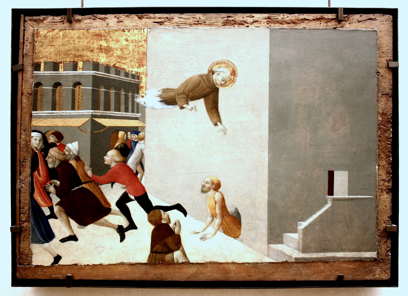
When someone mentions Italian Gothic painting in your presence I bet that the first name coming to your mind is Sassetta. A few others are also likely candidates, of course, but, to me, at least, Sassetta has the added interest of being the Chester Brown of painting. More than that: painting was his technique of choice to do... comics (others use drawings and words, that's the only difference). If you don't believe me just imagine his paintings as panels in a comic because that's what they really are: panels in polyptychs and predellas. There are three problems to view them as such though: 1) they're scattered all over the museums of the world; 2) some disappeared; 3) instead of being viewed as comics telling the life of Anthony or the life of Francis the visual tradition of the West, since the Renaissance, prefers to present them as single images. That paradigm shift also explains why comics are viewed as a minor art form. One = genius; two = stupid.


Stefano di Giovanni (Sassetta), The Blessed Ranieri Frees the Poors From a Florentine Jail1437 - 1444.


Chester Brown, Yummy Fur # 4, Vorterx Comics, April, 1987.

To help me prove my point I ask you to look above at the walls - planes -, some in the shadow, some not. Look at the doors that are just simple holes (rectangles) opening said planes to nowhere, or, if you want, to an ominous blackness... There's also a notorious absence of depth because the walls block the view creating a claustrophobic space. Look at the eerie atmosphere of it all...


Chester Brown, Louis Riel # 3, Drawn & Quarterly, December 1999.

Just like Sassetta's characters above, Louis Riel doesn't seem to be running. On the contrary, he seems to be frozen stiff, floating in space.


Stefano di Giovanni (Sassetta), Saint Anthony Beaten by the Devils, 1430 - 1432.


Chester Brown, "Matthew: 3:1 - 4:17," Yummy Fur # 17, Vortex Comics, August 1989.


Chester Brown, The Definitive Ed Book: Ed the Happy Clown, Vortex Comics, May 1992.

Many of Chester Brown's comics have a religious text and/or subtext. His demons though, are usually beautiful and young (sometimes too young as you can see above). They're not, like Sassetta's, Frankenstein-like creatures born of speciesism. Below though, Sassetta also represents the devil as a beautiful woman tempting Anthony. The only speciesist detail are the bat wings. 


Stefano di Giovanni (Sassetta), Saint Anthony Tempted by the Devil in the Guise of a Woman, c. 1435. 


Stefano di Giovanni (Sassetta), Saint Anthony the Abbot in the Wilderness, c. 1435.


Chester Brown, "Matthew: 14:1, 14:2; 14:12 - 14:23," Underwater # 3, Drawn & Quarterly, May 1995.

Gothic space doesn't ignore linear perspective, but it is not Naturalistic either. There's a stereotyping of rocks and trees that results in a kind of frozen expressionism. The trees above are very important to create the mood of both pieces. Chester Brown's backdrops are a bit more Natural than Sassetta's, but not much. He is careful to keep everything quite simple and to the point. There's a kind of dance in the composition lines of Sassetta's painting that leads quickly to the church (Anthony is inviting us to follow a path that's not a bed of roses; that's what the leafless trees are saying; the animals are allegories of worldly temptations). There's the same idea in Chester Brown's panels: Christ is alone going upward with determination against a strong wind.


Chester Brown, "Knock Knock," Yummy Fur # 31, Drawmn & Quarterly, September 1993.


Trees are very important for Chester Brown. They represent sexual desire in The Playboy, but he goes as far as to identify himself with them in the above panel.


Chester Brown, "Matthew: 14:24 - 14:31," Underwater # 4, Drawn & Quarterly, September 1995.

Chester Brown's compositions are absolutely flawless He has a tendency to use diagonals in order to enliven his hieratic drawing style (another Gothic feature). What's also great about him is his stunning use of the black and white areas.


Chester Brown, "The Playboy Stories: Part Two," Yummy Fur # 22, Vortex Comics, September 1990.


In the above panels there's no explanation for the ground to be black while the trees are completely white. The trees and Chester have no shadows creating a two-dimensional space that reminds the Nabis. The branches are entangled to convey Chester's feelings beneath his hieratic mask. One could say that (unforgivable sin) Chester's panels are decorative. And yet, there're purposes... The same purposes that we can find in Gothic painting: to be clear, to be slightly off (not quite Naturalistic... or not Naturalistic enough; but I'm being anachronistic in the latter's case), to create an engaging and disturbing atmosphere...

More Landscape Panels By Hugo Pratt, Héctor Oesterheld and Stefan Strocen

$
0
0

Héctor Germán Oesterheld (w), Hugo Pratt (a), "El Sargento Kirk: Ruta de sangre" [blood route], Misterix # 441, April 26, 1957.


Héctor Germán Oesterheld (w), Hugo Pratt (a), "El Sargento Kirk: Ruta de sangre" [blood route], Misterix # 443, May 10, 1957.


Héctor Germán Oesterheld (w), Hugo Pratt (a), "El Sargento Kirk: Ruta de sangre" [blood route], Misterix # 445, May 24, 1957.


Héctor Germán Oesterheld (w), Hugo Pratt (a), "El Sargento Kirk: La boda de Walpi" [Walpi's wedding], Misterix # 448, June 14, 1957.

With these images I want to give you a hint of how great an edition of Oesterheld's, Pratt's, Strocen's Sgt. Kirk would be if the Pratt estate didn't prevent it from happening.

Con estas imagenes quiero mostrar lo excelente que seria una edición del Sgt. Kirk de Oesterheld, Pratt y Strocen si Cong no lo impidiera.

September 25, 2008

$
0
0
This blog is 6 years old since last September 25. Did the situation of the real great artists in comics history improve since then? Are they recognized as such instead of the parthetic comics canon that we had 6 years ago? Not by any far-fetched stretch of the imagination! The situation is as if people considered the greatest films of all time to be B series films instead of the masterpieces by Mizoguchi, Ozu, Rossellini, Bergman, et al... In other words: money continues to talk and the canon continues to be upside down.


James Edgar (w), Tony Weare (a), "Gospel Mary," [London] Evening News, April 3, 1973.


Dan Mazur's and Alexander Danner's Comics A Global History, 1968 To the Present

$
0
0

Dan Mazur, Alexander Danner, Comics A Global History, 1968 To the Present, Thames & Hudson, 2014

While flipping through the book it was my whole life as a comics reader that I saw passing by.

Domingos Isabelinho

History and comics was never a good match. There are a few reasons why: 1) most so-called comics histories were written by fans which means that they weren't written by professional historians (comics fans are public servants, businessmen, lawyers, etc... etc... few have any kind of aesthetic education, I guess - if they did have such an education the comics canon would be much different from what it is, for sure...); 2) fans are also collectors and collectors are completists obsessed with who did what and raw data, hence, comics histories written by fans are not histories proper, but collections of facts; 3) comics fans writing comics histories don't use any methodology available to art historians; 4) apart from their own perspective as fans they don't approach their object of study from gender, post-colonial or queer studies... etc... I mean, they don't practice the, by now, quite old, New Art History; 5) comics fans have not a shadow of critical sense because they're fanatics and fanatics, as we know, don't think... to them everything is equally good (they are what Tom Spurgeon called, the Team Comics); 6) comics fans are absolutely parochial ignoring everything that falls outside of their interest area. I could go on...

What would be, then, a great comics history? It depends. To avoid social contextualization is almost impossible, I would say; formalism has a bad rep these days. Is it wrong to do close readings of particular comics, then? Of course not, if those close readings are done has a means to an end and not as an end in itselves. On the other hand that's just my take. The truth is that many perspectives are possible. For instance, here's what John Lent said (International Journal of Comic Art Vol. 16, No. 1, Spring 2014, 21):
Using elements in the communication paradigm (communicator, message, channel, and audience), comics studies fall short at every stage of the continuum, except for the message (text), which receives considerable attention. 
John goes on saying, for instance, that "the publishers [are] virgin research territory." This means that a history of comics may assume many forms and not all of them involve aesthetic evaluation. Two of the best comics histories (if not the only two worth mentioning), David Kunzle's monumental history of comics from the 16th. to the 19th. century (in two volumes) and Comics Strips and Consumer Culture 1890 - 1945 by Ian Gordon, are two such books. Which is unfortunate for yours truly because I would love to see an old fashioned aesthetically discriminative account of the history of comics, brimming with white dead men and all (with the occasional Geo Herriman thrown into the mix for good measure, of course).  

Is Comics, A Global History, 1968 To the Present by Dan Mazur and Alexander Danner such a book? Well, yes, and no... Yes, because everybody is in there; no because you just need to look at the cover to see that, if The Shadow is included, the authors also included a lot of dreck. 

The problem, or the question, that I'm really facing is as follows: comics are both an art form and an industry (even if most people just view them as the latter), can a history of comics ignore half of that equation? I would, for the most part, of course, but I would be completely wrong if doing so. Because, you see?, aesthetically it's impossible to separate the two. Dan Mazur and Alexander Danner are perfectly correct when they stress Charles Schulz's Peanuts influence on North American alternative comics artists. And that's just an example. They're also right when they talk about Jack Kirby's influence on Aristophane's Conte Demoniaque. And yet...  I would never say things like "the high level of artistry and imagination comics creators could bring to the form, in the decades when it was primarily a commercial children's medium." This in a legend to a mediocre Tintin magazine cover by Bob de Moor!, of all people! Since the above quote practically opens the book, that's what I call to start with the wrong foot. Also, the fact that mainstream artists (I'm strongly fighting against the urge to use the word "hacks"!) have influenced other artists doesn't mean that they're on the same aesthetic level: Aristophane was a better artist than Jack Kirby, obviously. Joost Swarte is better than Hergé.

Giving equal space to Moebius and Fabrice Neaud does a disservice to the history of comics. I understand that Mazur and Danner answered my above question by writing a history of the best that the industry has to offer (I don't have any doubts about that either) and the best that the art form has to offer. This, at first glance, seems like the right thing to do, but it throws everybody into the same indiscriminate cauldron (that damn Asterix!, my metaphors are proof enough that I'm being influenced by the book I'm reviewing!, help!).

Now, the good parts are very good. Chapter 16, for instance, is one of the best syntheses that I've read about French / Belgian alternative comics of the 1990s. As I said above, everybody is in there (except the Canicola collective and Pierre Duba, that is) and flipping through the book when I received it I was immediately struck by memories of reading The Cage by Martin Vaughn-James and Raw magazine, Mat Brinkman and  John Porcellino, Baudoin and Vincent Fortemps, Yoshiharu Tsuge and Alberto Breccia along with many others who filled my comics reading hours. Dan Mazur and Alexander Danner wrote reviews of every author's work contextualizing it in comics streams, never leaving the closed comics world to venture into society's larger realms. That's OK to comics readers, I suppose, but it may be too fannish to those who don't read comics regularly (will they buy this kind of book though?).

The best this book has to offer, beyond including the best comics artists of the last, panorama changing, forty five years, is the global approach. To return to historiography, the global (transnational) look at historical events is a contemporary tendency that tries to transcend national(istic) historical narratives. As the first attempt to do so in comics historiography this book is a landmark. Maybe not as important as Kunzle's books, but that's a tall order to match.

Since I should change this blog's title to "Viva Oesterheld," I'll finish with another pet peeve. The book's intro goes back before 1968 to find the roots of adult comics. In doing so it features Ltn. Blueberry by Charlier and Giraud (Moebius) failing to mention Sgt. Kirk by Oesterheld, Pratt et all. That's like citing Van Meegeren instead of citing Vermeer (also, I don't agree that Pilote magazine is that important). Finally, how can anyone cite the mediocre British comic strip "Modesty Blaise" and forget the masterpiece "Matt Marriott"? Kudos to the inclusion of "Carol Day" by David Wright, though.


Dan Mazur's and Alexander Danner's Comics A Global History, 1968 To the Present - Coda: What is an Artist? (Part One)

$
0
0

"Aristophane was a better artist than Jack Kirby, obviously. Joost Swarte is better than Hergé."
Domingos Isabelinho


Nothing is obvious, ever, but, in this case, even less so. That is why I want to explain myself.

First of all I mean "artists" not "draftsmen." This is an important distinction and I bet that my scarce readers, enlightened as they are, misunderstood me. Anyway, what, in my humble opinion, did Aristophane and Joost Swarte do so well and what did Jack Kirby and Hergé do so poorly?

An artist, to me, is someone who senses the world around and conveys her / his vision of it through art. In order to do so a comics artist (or a team creating comics) needs to master her / his craft. This means that Jack Kirby and Hergé were great craftsmen, but were they great artists? Because craft is important, I don't deny that, but it is far from being enough... A world vision isn't enough either, by the way, because it may be clichéd and trite. (Talking of which, to quote a cliché, a world vision is like an arsehole, everybody has one.)

Conversely a poor artist bowdlerizes reality, uses stereotypes and cardboard stock characters, follows Manichean genre formulas, etc...

Georges Remi (aka Hergé):


Georges Remi (Hergé), "Tintin au Congo" [Tintin in the Congo], le petit "Vingtième," November 20, 1930. A racist blackface minstrel character.


Georges Remi (Hergé), "Tintin en Amérique" [Tintin in America], le petit "Vingtième,"September 29, 1932. Racist "yellow peril" characters.


Georges Remi (Hergé), "Le Lotus Bleu" [The Blue Lotus], le petit "Vingtième," December 6, 1934. A racist buck teeth, pig-nosed, Japanese character.


Georges Remi (Hergé), "L'étoile mystérieuse" [The Shooting Star], Le Soir [a Nazi newspaper in occupied Belgium!], November 19, 1941. Racist Anti-semitic characters while Jews were chased all over Europe.

Apart from these racist representations Hergé's world is Manichean and misogynous. In time he got fed up with these simplistic representations of the world and tried to be a gallery painter. Unfortunately for him, he also failed in the intent. He did not fail, however, in creating an industry and becoming a very wealthy man. That is the ultimate success story in our value free, anything goes to make a buck, Western World...

In spite of all this I have some fondness for his bourgeois play (theatre de boulevard), Les bijoux de la Castafiore (The Castafiore Emerald) and for some of his clever formal devices, but that's about it...

Joost Swarte:

I'm not a huge fan of po-mo irony, but if I were Joost Swarte would absolutely be my cup of tea. He's an intelligent, sophisticated, visual thinker if there ever was one (and believe me, there were). Unfortunately for the art form (if you have a narrow definition of same, that is...) Joost Swarte is more of an illustrator and a graphic designer these days than a comics artist. His print series (you can see a couple of prints below) are some of the greatest ironic comments on the human condition and modern life produced by a comic artist.


Joost Swarte, "De spiegel" [the mirror], print by Caro, 1983. 


Joost Swarte "Libre enfin!" [free at last], Enfin! [finally] portfolio, Futuropolis, 1981.

From the intro to Enfin! (by Étienne Robial?):
Life is a long battle for money, sex and power, for light and inspiration... to end irrevocably as a moneyless, sexless, powerless corpse in dark earth, inspiring nothing but worms and chrysanthemums. Free at last... The futility of human striving, the irony of results being the negatives of our goals, has been Swarte's inspiration for the portfolio.
Swarte's peculiar use of empty spaces helps him to convey the feeling that his characters are lost and overwhelmed by huge forces beyond their control (even if they are oblivious to the situation like the fellow leaving jail above).


Joost Swarte, Untitled [Joost Swarte and Robert Crumb read Crumb's The Book of Genesis with a little "help" from god], print by Griffioen Grafiek, 2009. Notice blackface minstrel Felix the Cat on the background.

The image above illustrates the fact that Joost Swart and Robert Crumb belong to the same generation (Crumb b. 1943; Swarte b. 1947). They both share the same camp (underground) aesthetic finding graphic inspiration in the comics that they both read when they were children: Walt Disney funny animals and "big foot" style comedy for Crumb, Tintin albums for Swarte. Ideally this creates a second degree post-modern feeling that's distancing and cool. Joost Swarte is also inspired by art deco cartoonist extraordinaire (as was Hergé, in fact) George McManus (as you can see below). Furthermore, the use of technical perspectives (isometric projection above) coupled with a clear line aesthetic (Swarte coined the term) underlines the emotional distancing of Swarte's drawings.

   
George McManus, "Bringing Up Father," Sunday comic strip, April 28, 1940.

Both Swarte and Crumb admire early 20th c. mass culture, then, warts (racism, for instance) and all... Being campy one assumes that Crumb's and Swarte's racist imagery cannot be read as racist, right? Well, wrong!

As David Pilgrim, of the Jim Crow Museum put it: "When satire does not work, it promotes the thing satirized"

Robert Crumb, "Angelfood McSpade,"Zap Comix # 2, June 1969. ("When satire does not work, it promotes the thing satirized".) For a more thorough exploration of the issue, see here.

The problem is not as blatant in Joost Swart's case, but it is not totally absent from his work either. His most famous character, Jopo de Pojo, has a racist echo in the third degree. According to Swarte Jopo de Pojo is a blend of his favorite comics characters:


Joost Swarte "Jopo de Pojo," design for a t-shirt, 1980; recolored for a print by Griffioen Grafiek, 2011.


Earl Duvall (w and p), Al Taliaferro (i), "Silly Symphonies: Bucky Bug," Sunday comic strip, January 10, 1932.
[Jopo's] trousers come from Tintin. The badge on his jacket is the symbol from the title of the Krazy Kat comics. His head is inspired by old Disney bug characters, and a sort of early Felix the Cat. As I am a music lover I included elements of a musical note in his head. A (shiny) black ball as his head, and a hairdo like the flag. 
The Disney bugs are the second degree, but, since those bugs had racist tones, the third degree reading has a, albeit distant, racist subtext.


Joost Swarte, "I'll Play the Blues For You," as published in Raw Vol. 1 # 1, Fall 1980 [1977]. It's not difficult to guess why Art Spiegelman and Françoise Mouly let this page fall from their anthology of the first three issues of Raw (vol. 1), Read Yourself Raw.

Notice, however, that "I'll Play the Blues For You" is the only page by Joost Swarte with offensive blackface minstrel imagery.

A final note:

Ethics and aesthetics are the same thing to me, but, since I'm in explanation mode, I want to explain why. As Charles Johnson put it in Fredrik Strömberg's Black Images in the Comics:
If these images spring from an epistemological difficulty or a technical dilemma related to draftsmanship rather than purely racist intent ([...] that, of course, is the very point of art, comic or otherwise: to put us "over there" behind the eyes of Others), then we should call this visual short-hand for people of color by its proper name: intellectual and creative laziness.
[..] these Ur-images of blacks, are a testament to the failure of the imagination (and often of empathy too) [...].
Maybe I focused this post on stereotypical representations of comics characters too much, but what Charles Johnson says above could be easily transposed to other features of comics like plot formulas, Manicheism and frivolity. All of the above are epistemological failures, used to make a buck... In other words: unethical imagery is not a product of aesthesis. Hence, it does not put us "over there" in any creative and meaningful way... In art criticism poor ethics stops being a moral problem to be an aesthetical failure due to the laziness of hacks... or... the demands of their bosses.
Viewing all 326 articles
Browse latest View live


Latest Images